AIM:
Starburst were ambitious to reconnect with the youth. Regain category leadership. Create more impact on shelf and beyond.
SOLUTION:
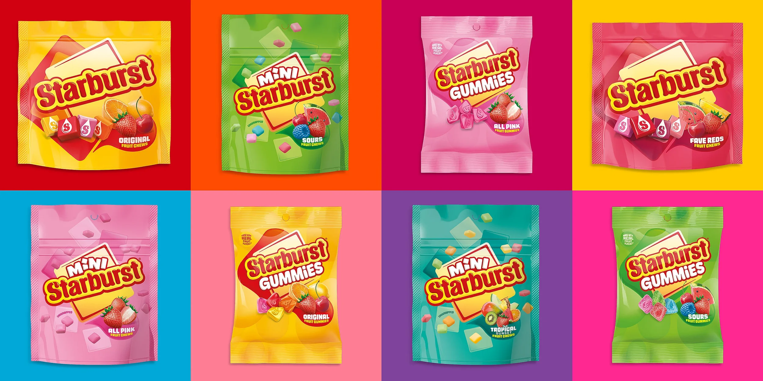
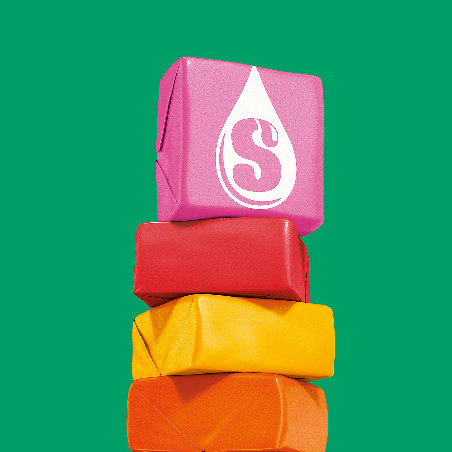
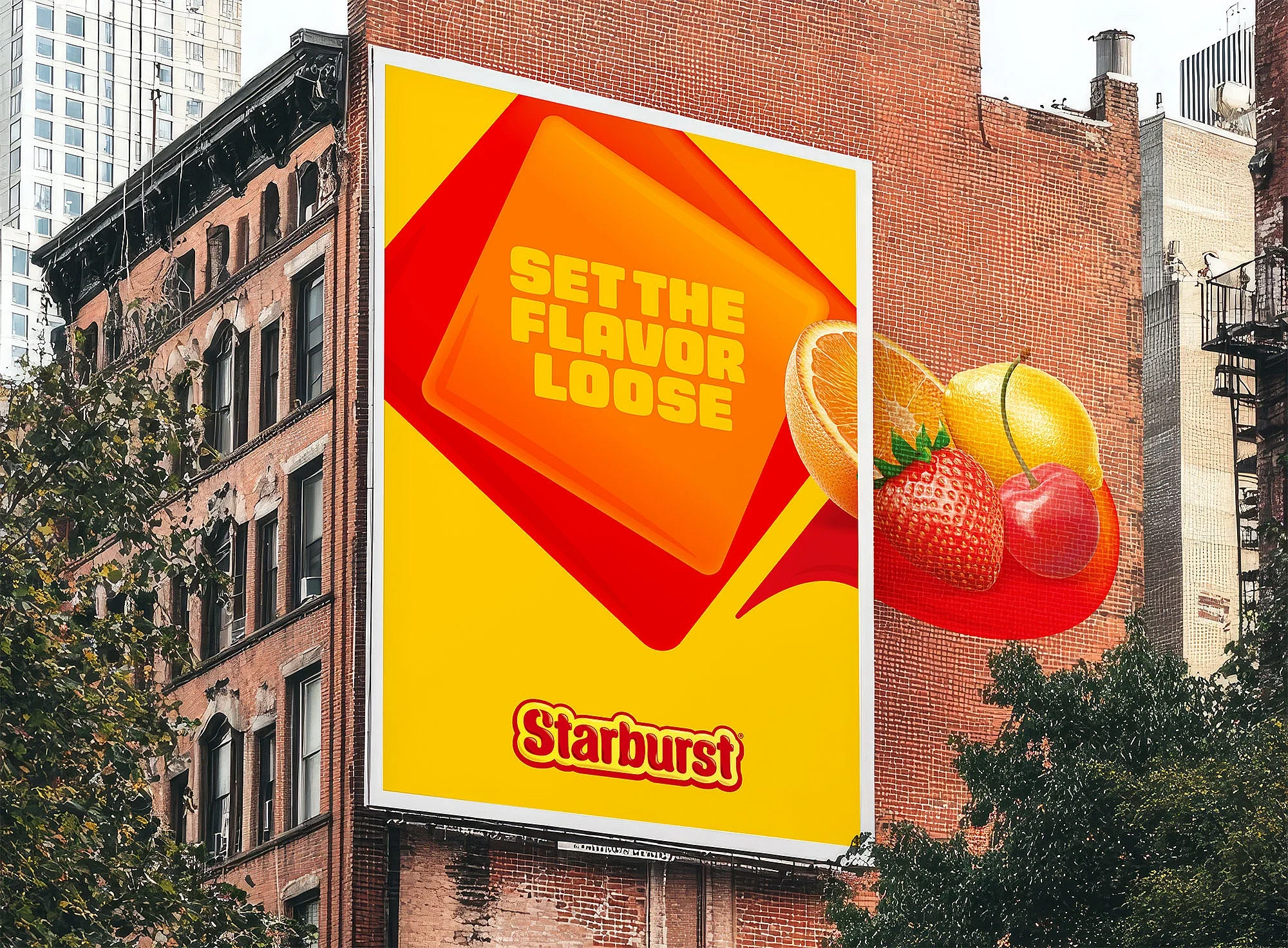
With refreshed brand assets, a reimagined word mark, playful typography and a distinct colour palette, the Starburst iconic square shape and fruitiness now lives in a universe of joy that invites everyone in, stands out and differentiates the brand’s many SKUs.
Rationale.
This iconic brand was losing clarity at shelf and beyond. Competitors crowded in, assets drifted, and consistency slipped. To fuel our fresh TikTok fandom, we needed to embrace the excitement and create future‑proof appeal. So, we rebuilt the brand world around what makes Starburst unique: juicy fruit, joyful energy, and that irresistible square. Inviting. Impactful. Built to flex.